Red Bull Brand Pack
Complete usage system
Brand Pack
Complete Red Bull Brand Direction
This pack includes logos, icon language, typography system, color rules, and channel usage guidance in one place. It is built from your provided logo asset and Red Bull visual cues: athletic, kinetic, high-contrast storytelling.

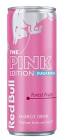
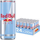
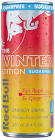
Editorial Image System
Use a fast-moving image stream that mixes large hero moments with smaller supporting cuts, then layer concise category tags and headlines.
Feature
Energy Culture
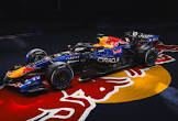
Racing
Track Atmosphere
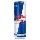
Product
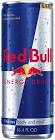
Can Focus
Athlete
Preparation
Event
Competition Zone
Live
Race Day
Film
Action Replay
Crew
Behind Scenes
Series
Story Drop
Clip
01
Clip
02
Clip
03
Clip
04
Clip
05
Clip
06
Feature
Athlete POV
Feature
Venue Detail
Feature
Product Signal
Feature
Campaign Shot
Hero Frame
Closing Brand Moment
Brand Foundations
Use these principles to keep campaign, product, and content design aligned across every channel.
- Performance under pressure.
- Progression through challenge.
- Athletes, creators, and competition culture.
- High contrast with deep blue foundations.
- Directional angles and diagonal motion cues.
- Strong editorial hierarchy with modular cards.
| Level | Purpose | Style |
|---|---|---|
| Hero | Launches campaign narrative | Large uppercase display + high-energy image |
| Story | Delivers event or athlete context | Card layout + concise subhead + CTA |
| Support | Provides detail and utility | Compact type blocks + neutral backgrounds |
Logo System
Maintain logo consistency with clear-space, size, and contrast rules. Use the same local source mark throughout digital and print touchpoints.
Minimum digital: 48px
Minimum print: 18mm
Clear space: 0.5x logo height
- Place on clean, uncluttered fields.
- Prefer top-left or centered anchor positions.
- Avoid low-contrast photographic collisions.
Icons and Mark Language
Use supporting icons to reinforce action, speed, and system guidance.
RB badge
Wing mark
Energy bolt
Color cue
Grid system
Media action
- Keep icons in the core palette only.
- Use consistent stroke and corner language.
- Reserve yellow/red for highlights, not full fills.
- Mix random gradients or drop shadows.
- Warp symbol proportions.
- Pair with thin lightweight text styles.
Color System
Use the palette with strict role assignments so the brand signal stays recognizable across product and campaign surfaces.
Core Blue#001A70
Night Navy#05091B
Pulse Red#DB0A40
Boost Yellow#FFD338
Metal Ice#CFD8E3
| Color | Role | Use Ratio |
|---|---|---|
| Core Blue | Primary canvas and surfaces | 50-65% |
| Night Navy | Depth, overlays, footer zones | 15-25% |
| Boost Yellow | Primary CTA and key callout | 8-15% |
| Pulse Red | Alert, competitive tension, highlights | 4-8% |
| Metal Ice | Dividers, neutral UI, support text | 8-12% |
Font System
Pair condensed display typography with clean compact body copy. Keep hierarchy sharp and avoid decorative script fonts.
Wings. Speed. Precision.
font-family: "Teko", "Barlow Condensed", sans-serif;
- Use weights 600-700 for headlines.
- Keep tracking tight and uppercase.
Design for movement. Keep copy short, confident, and action-first.
Prioritize event context, athletes, and measurable outcomes.
font-family: "Barlow Condensed", Arial, sans-serif;
- Use 400-600 for body and UI labels.
- Target line length: 45-70 characters.
| Text Type | Size | Weight | Use |
|---|---|---|---|
| Hero Display | 64-88px | 700 | Campaign hero and launch pages |
| Section Heading | 32-44px | 600 | Page modules and card groups |
| Body Copy | 17-22px | 400 | Editorial and product descriptions |
| Utility Label | 12-14px | 600 | Tags, metadata, and status chips |
How To Use It
Apply the pack consistently by channel so audiences see one coherent identity across web, social, video, and event surfaces.
- Place logo top-left in header and footer.
- Use blue/navy backgrounds for major sections.
- Reserve yellow for primary CTA and key metrics.
- Use one bold headline and one action line.
- Keep logo away from busy image focal points.
- Use icon chips for series/format consistency.
- Open/close with logo slate and clean clear-space.
- Use quick directional transitions (120-220ms).
- Anchor lower-thirds in blue with yellow accent.
- Respect minimum print size and contrast rules.
- Keep signage typography uppercase and condensed.
- Avoid adding unapproved secondary palettes.
UI Components
Recreate a card-first visual hierarchy with high-energy CTAs and edge lighting patterns.
Motorsport
Inside The Race Weekend Routine
Voice and Motion
- Write short headlines with a physical verb.
- Lead with athletes, crews, and competition stakes.
- Keep tone confident and kinetic, not casual.
- Use staggered section reveals on first view.
- Keep hover motion quick (under 200ms).
- Favor directional movement over bounce effects.
Asset Inventory
Current local pack files available in this project. Add more official logo variants to this folder and they can be mapped into this page.
./red_bull_logo.png- primary local logo source./hero_generated.svg- generated top hero banner artwork./redbull_google_01.jpgto./redbull_google_20.jpg- editorial image set
Teko- display headlinesBarlow Condensed- body and UI textArial / sans-serif- fallback stack